Key Takeaways
- Confirmation screens reassure users that their action was successful and reduce uncertainty.
- Clear messaging helps prevent errors like duplicate submissions and builds trust.
- Including next steps guides users and encourages further engagement.
- Personalization and visual cues make confirmations more meaningful and easier to understand.
- Avoid vague messages, lack of guidance, and overly cluttered screens.
- Well-designed confirmation screens improve user satisfaction, conversions, and long-term loyalty.
Understanding Confirmation Screens
Confirmation screens serve as the final touchpoint in a user journey, typically appearing after a form submission, a purchase, or the completion of an important task. Their primary function is to reassure users that their desired action has been successfully registered. This simple yet vital step provides feedback and helps ease any uncertainty about whether the user’s input has been processed. For businesses aiming to improve the digital experience, confirmation screen UI patterns can serve as a benchmark for clear, engaging confirmations.
Alongside reassurance, effective confirmation screens offer users guidance on what to do next or supply further details about their completed interaction. Whether confirming a payment, a newsletter sign-up, or a support request, these screens can set the tone for the ongoing relationship between the user and the platform. When used correctly, confirmation screens can be pivotal in establishing trust and enhancing the overall experience.
The Role of Confirmation Screens in User Experience
Thoughtfully crafted confirmation screens play a strategic role in building user confidence. Without explicit confirmation, users may feel unsure or repeat actions, risking double entries or abandoned journeys. In contrast, clear messaging at the point of completion affirms that everything worked as expected. This feedback is crucial for fostering a sense of reliability and stability within digital products.
Additionally, confirmation screens create opportunities for businesses to encourage user engagement beyond the completed action. For instance, users completing a form might be guided to relevant resources or encouraged to continue exploring related services. This seamless transition enhances satisfaction and can lead to deeper brand loyalty.
While the main purpose of confirmation screens is to enhance the user experience, their impact on conversion rates should not be underestimated. Positive post-action feedback can act as a subtle motivator, prompting users to take further steps, such as sharing their experience, signing up for benefits, or making repeat purchases. Over time, these incremental boosts can make a significant difference in customer lifetime value.
Conversely, a poorly executed or ambiguous confirmation screen can have the opposite effect. Users who are unsure whether their action was registered are less likely to trust the business or return for future interactions. Addressing these usability issues improves satisfaction and can reduce costly support inquiries.
Best Practices for Effective Confirmation Screens
- Clarity: Every confirmation screen should give users a clear statement about what has just happened. Avoid technical jargon and ensure your message is easy to understand.
- Next Steps: Guide users on what to do next or highlight any additional tasks they might want to complete. This may include account activation, accessing related content, or following up on a service.
- Personalization: Calling users by name or referencing specific details helps the confirmation feel genuine and reassuring. Personal touches improve engagement and create stronger user connections.
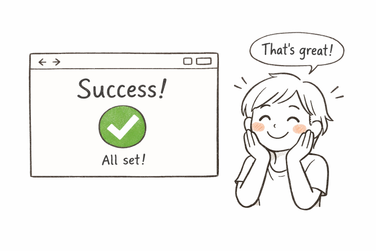
- Visual Cues: Use friendly icons, brand-aligned colors, or positive imagery to quickly signal success. Visual signals support the messaging and help users absorb the result instantly.
Common Pitfalls to Avoid
Ineffective confirmation screens can hinder rather than help, so it is important to watch out for common missteps. One of the most frequent problems is the use of generic or vague messages such as “Your submission was successful.” Without context or follow-up, users may still feel uncertain about the outcome.
- Avoid messages that lack specific detail, particularly if users expect clear outcomes (such as order numbers or next steps).
- Never leave users without guidance on what to expect afterward. It is frustrating to complete an action and receive no relevant information.
- Be cautious about overloading your screen with dense text or too many links, as this can overwhelm users rather than reassure them.
Real-World Examples
Imagine a scenario where a user completes a checkout and is greeted by a clear message: “Thank you for your purchase, Sarah! Your order #2549 will arrive within 3 business days.” This combination of gratitude, personalization, and actionable information gives users peace of mind. Similarly, after submitting a support ticket, a message stating, “We’ve received your request and will respond within 12 hours,” establishes clarity and manages expectations right from the start.
In the world of banking apps, confirmation screens often display transaction success, including the transferred amount, recipient, and updated balance, to ensure no lingering doubts remain. Many hospitality apps include next steps, such as reservation details or links to manage bookings, maximizing user satisfaction. As technology continues to evolve, companies that prioritize thoughtful confirmation experiences often see improved retention and positive feedback, according to insights from Hashbuilds’ report on confirmation dialogs.
Final Thoughts
Confirmation screens are integral to digital workflows, providing critical closure for user actions while doubling as touchpoints to boost trust and engagement. Through clarity, personalization, visuals, and purposeful guidance, companies can transform these simple screens into conversion catalysts. By consistently applying best practices and avoiding common mistakes, businesses create smoother experiences that not only reduce churn but also foster long-term loyalty.